In June 2016, Hantz from Stoovo reached out to me and we talked about what Stoovo would later become. During my two and a half years with Stoovo, I helped with everything that one could: from creating a visual identity to doing simplistic mobile interfaces and B2B dashboards.
Being the first person to join the cofounders, the venture had a design-led approach where the whole focus was on the user, not VC-imposed KPI's. I was incredibly lucky to have worked and learned from the whole team.
Meanwhile, the startup grew into a company, hired more people, impressed at Y Combinator and was finalist of StartupGrind because it managed to do fintech in a friendly and approachable way.
Behind the logo
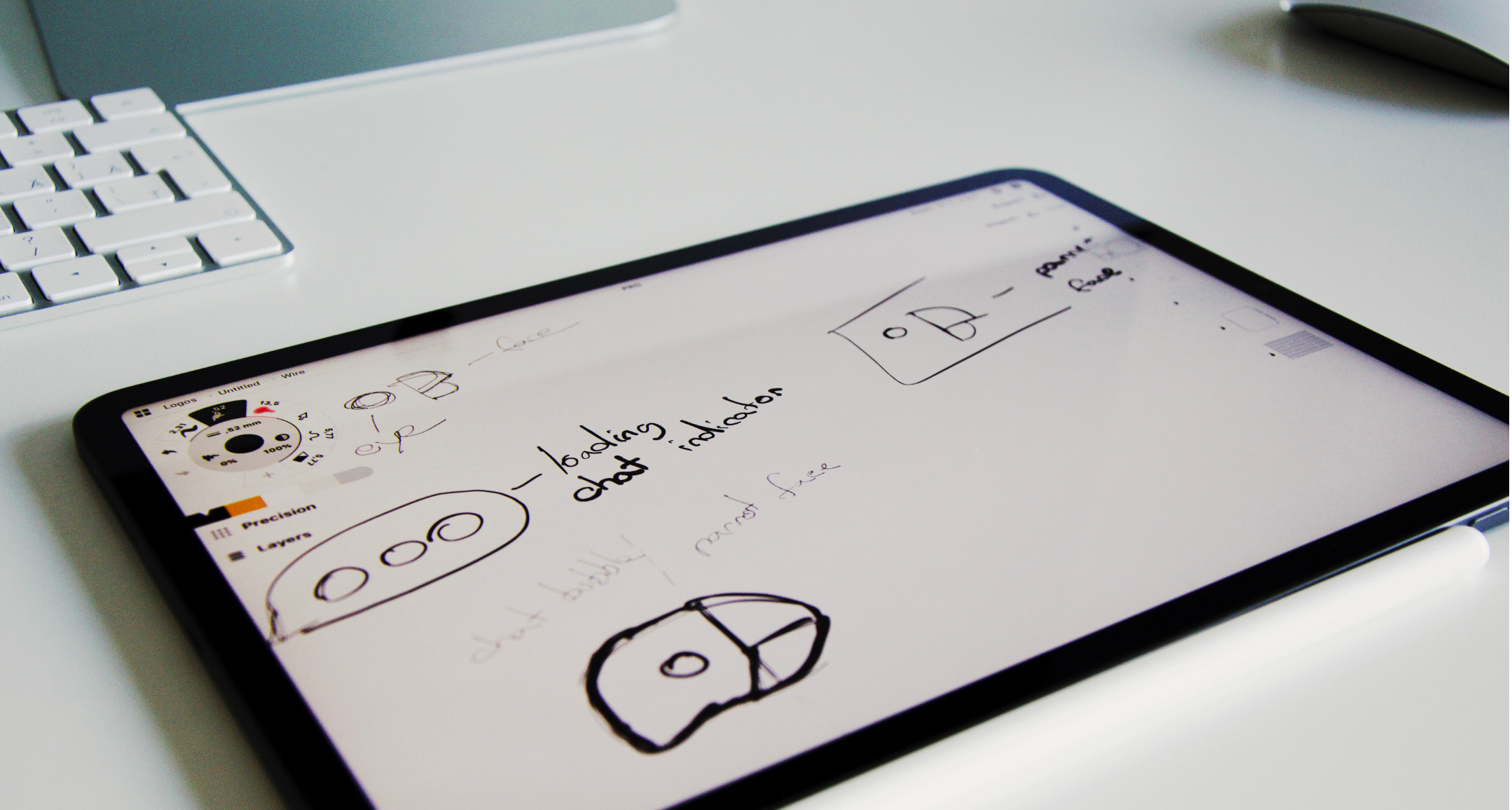
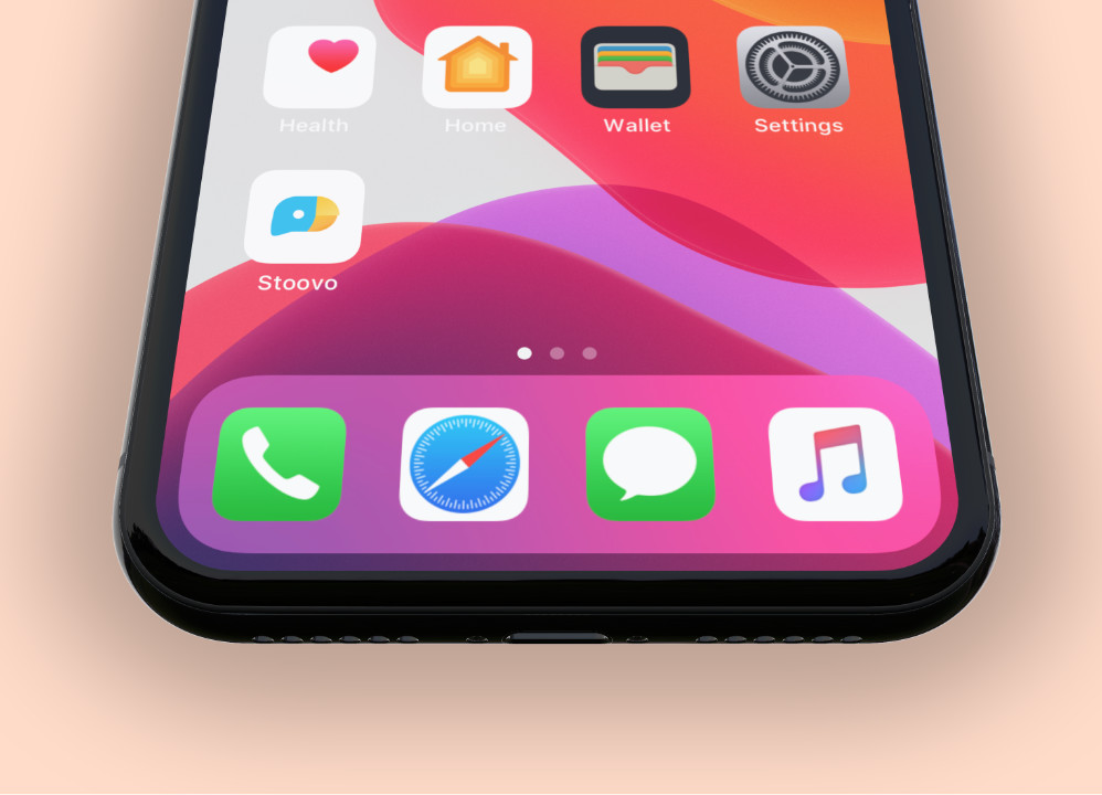
Initially presented as AI chatbot that analyses your expenses, we sat down and worked on a visual identity that would later be a friendly face on your homescreen.


A nice-long identity process
Before launch, it took some time to draw app icons for the each environment & for the beta builds, the press kit and other promotional materials — but was fun! You know those data-heavy dashboard in fintech? I didn't want people to focus on the UI in the marketing shots and rather promote the friendly, helpful face in Stoovo.
Leave no stone unturned
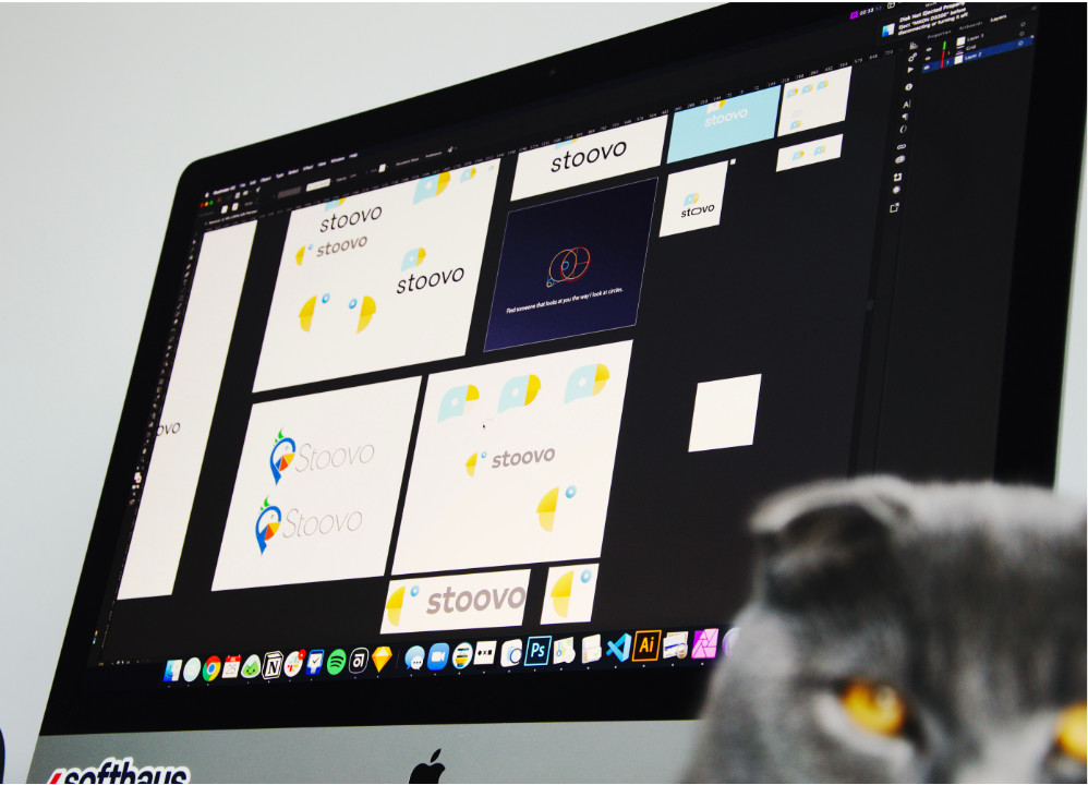
With different scenarios of tone and personality, we had multiple branding explorations and ended up using the chat-parrot face. The cat says hello.

The User Interface
It was the team's decision to maximize the use of native components for both iOS and Android.

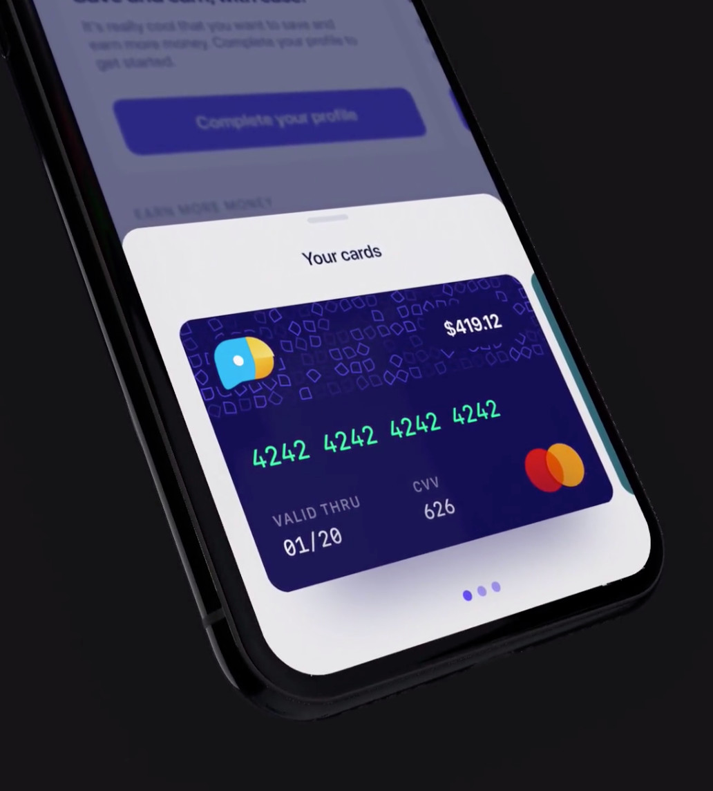
After the initial launch, we spent months experimenting with the interface (colors, typography, paddings...), as well as refining the user onboarding experience. During the latest redesign, we pushed hard towards making it much more easier to find & accept gigs through the Opportunities view, as well as marketing the features right after you'd create an account.
To be able to iterate faster, towards the end of 2018 we decided that it was the right time to make a design system for the company (read UI) and started documenting all of its components and more importantly, gestures and motion design. Initially built on Sketch + Abstract but later ported over to Figma. Sweet setup!
Epilogue
Looking back, Stoovo was one of the nicest experiences I could have asked for. Because it was a small & agile startup, I learned that sometimes design can have too much power and do some damage. The sweet spot is to find the right balance between business goals and user needs.
I had spent all of my tenure at Stoovo exploring, maintaining and designing. The result of my work can be seen by downloading the iOS app, which is in a public beta (U.S. only).
